


It’s hard work starting your own company, but there’s also plenty to look forward to during the process. From deciding on a name to finding the ideal location, building a business from the ground up can be just as fun as it is challenging.
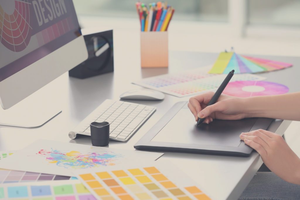
One of the best parts is choosing a logo. Seeing your business creatively represented onscreen or on paper is incredibly exciting and, if you’re still getting ready to launch, can make it seem like all that effort is finally starting to materialize.
But, if you aren’t artistically inclined, you probably have no idea where to start. Choosing a logo at random is not best practice and will likely set you up for failure in the long run. So, with new entrepreneurs in mind, we’ve put together the following criteria as a guide to great logos. Be sure to keep these essentials in mind when working on your design, and you’ll have a bold, beautiful logo that will define your brand for years to come!
A Good Logo Starts With Your Business Name


Unless you always had an idea in mind, you probably spent a lot of time deciding on the right name for your business. What you call your company has a significant effect on how potential customers or clients will perceive it.
Your logo has a similar purpose: To brand your business. The ultimate goal of logo design is to create a visual representation of who you are and what you do, in a way that’s easy to read and remember.
Graphics are important, but focusing on your businesses name before adding artwork to your logo is a highly recommended practice, especially for anyone with limited design experience. Icons and illustrations draw the eye, but if you don’t have a great foundation to start, you could end up putting too much emphasis on the wrong design element.
Choosing a clear, legible font should be your first step. Bold, crisp sans serif fonts like Helvetica, Garamond and even basic Arial pair beautifully with almost any graphic. For those who prefer a serif option, Minion and Garamond have a modern feel. Remember that in most cases, your name should be the largest part of your logo, and even if it isn’t it should still be what commands the most attention.
You don’t need to decide on the exact font or layout of your text before you bring graphics into the mix, after all you may want to use shapes that play off of or interact with your lettering. But, by making your business name and its readability your primary concern, you’ll be sure to end up with a design that checks all the boxes.
Choose a Clean Design
Complicated, complex graphics and fonts can be incredibly impactful when done right, but as a new business owner it’s best to stick to the basics.
That doesn’t mean boring! When it comes to graphics, simple two- and even single-color designs are often more striking than their overly intricate counterparts. Check out the following examples:

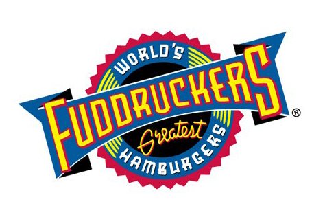

The first logo is far too busy. There’s no clear focus area, and the colorful, detail-filled badge competes with the text, especially at such an odd angle. The second example is much more direct, with the name of the business front and center. The graphic plays off the text, and it doesn’t look like either element was added as an afterthought.
Think about all the different places your logo will eventually be used. On signage, on your website, in your letterhead and other documents, in email signatures, on t-shirts or other promotional materials…Virtually anywhere, and that’s just naming a few. You need artwork that looks good at any size, in any application, in both black and white and in color. Occasionally complex designs fit the bill. Clean, simple ones almost always do.
Horizontal vs. Vertical Logos
One of the most common issues designers run into when trying to use a company’s logo in a new web or document design is the orientation. If you’re trying to make a long, rectangular logo fit into a square or vertical space sizing can get funky real quick. And vice versa when you have a vertical logo and a wide, skinny space to place it in.
And it’s not just a design issue. Many businesses work with partners or nonprofits who will ask to use a logo, and often they aren’t as picky as designers when it comes to making sure the aesthetics are right.
So should you use portrait or landscape, which is the best option? The best answer isn’t one or the other. It’s both.


Choosing a versatile, adaptable logo design that can be altered to fit different layouts is supremely useful. Even if you don’t need both right away, creating two versions will save you, and any designers you employ, some massive headaches in the future.
If you’ve followed our first two tips, chances are creating an additional vertical or horizontal layout for your logo will be easier than you may think. Simply stacking your clean text and bold graphic in a different way will often do the trick in a way that’s still visually interesting.