


As a digital marketer, crafting a quality landing page is vital to the success of your marketing campaign. A good landing page has inviting copy and an appealing design that leads customers to give the information the marketer is seeking, an action known as the conversion.
The premise sounds simple, and it really is, but getting a conversion can hinge on the the design of your page. Is it attractive to the eye or is it hard to look at? Is there way too much content on the page or is there not enough information? Finding a good balance within the design of your landing page is key to getting the viewer interaction you want, and can be the difference between whether your campaign flounders or rakes in leads.
Structure
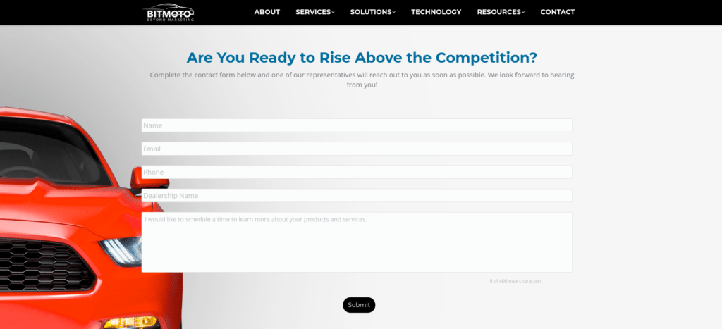
One of the two main display elements that is critical to a landing page is its structure. A landing page that is too crowded or has too much content will quickly cause the viewer to lose interest, whether it’s because the form is too long or there are too many elements — be it text or images — on the page.
Just as with landing page copy, the design has to be attractive yet simple, as viewers want to see something that is easy on the eyes, interesting and simple to navigate.
Keep forms and graphics as simple as possible so your potential customer doesn’t feel like pursuing more information is a chore. The busier your landing page is, the less likely someone is going to take the time to absorb the information on your page and positively respond to your call to action.
Color and Graphics
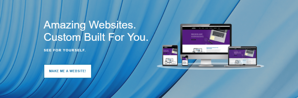
The right use of color and graphics is another factor that is extremely important for the success of a landing page.
A landing page without any color or visual elements will kill any chance of a conversion. The reasoning for that is simple: visual appeal is crucial on the internet. Would you read or click on a page that has no color, images or attractive logos? Probably not.
By using colors and graphics that complement each other — and do so without attacking the viewer with clashing colors — you’ll create an attractive landing page that generates curiosity in the viewer, increasing the chances of a conversion.
While colors should almost always complement each other, contrast is important in your landing page, too, particularly between a form or call to action and the rest of the page. Creating contrast that makes important parts of your page stand out is a great practice to utilize when creating landing pages, as viewers will automatically be drawn to important text and forms.

In Conclusion
To conclude, when creating landing pages designed to prompt viewer interaction, the layout of the page needs to be attractive, simple, and easy to navigate. Remember, the goal of a landing page is to give the user the largest benefit as to why they should contact you, and this can only be done if the prospect is intrigued enough by your design to read through your content.
Using contrast to make forms and calls-to-action stand out is another tactic you’ll want to turn into a habit so viewers can see exactly what you want them to do right away.
For more information on developing successful landing pages for your business or organization, Strunk Media Group’s digital marketing team can help you develop a custom strategy to create landing pages that work for you.